The Invisible Box Around Your Text, and How to Finally Trim It
Remove the empty space CSS bakes around text. A one-line, optical fix using text-box-trim and text-box-edge, with progressive enhancement for browser support.
Every font ships with empty vertical space baked in above and below the letters. For years the only way to remove it was magic-number margins and prayer. text-box-trim makes it a one-line, optical-not-metric fix.
Type some text in a heading and inspect it. The glyphs don't fill the line box, there's a sliver of empty space above the capitals and below the baseline that you never asked for. It's not padding. It's not margin. It's the font itself, and every font has a different amount of it.
That invisible space is why a button's label never looks quite centered, why the gap above your <h1> is always a few pixels off from the gap below it, and why you've shipped more than one margin-top: -0.15em with a comment that just says // don't ask. There's finally a real fix: the text-box-trim and text-box-edge properties. Let me walk through what the space actually is and how to cut it cleanly.
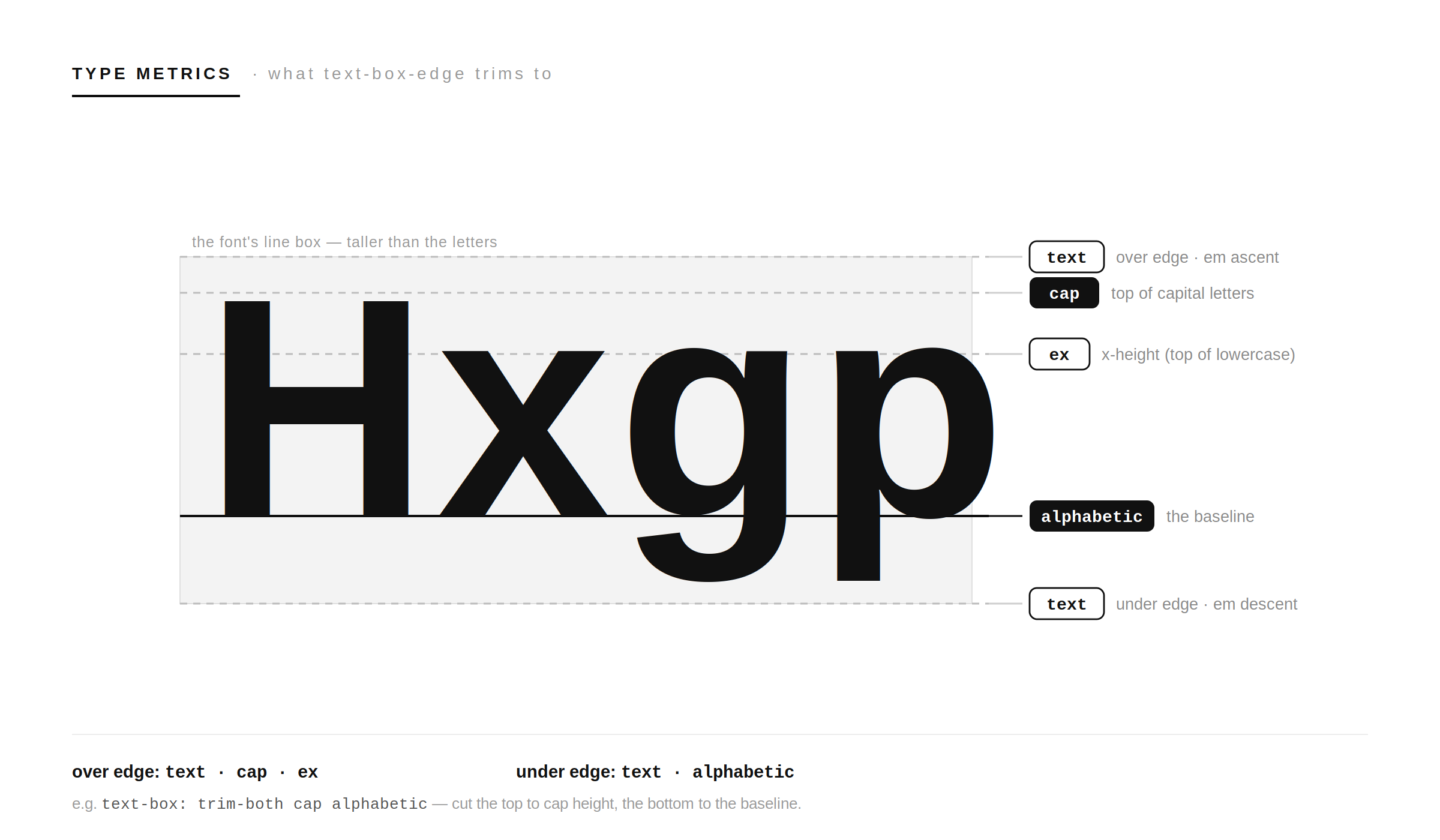
What is the invisible space?
It's called leading, specifically half-leading. Every font file defines its own default line height, larger than the letters themselves, and the browser splits the extra space into two halves: one above the text, one below. S4 Different fonts bake in different amounts, which is exactly why consistent vertical typesetting has always been a pain on the web: the same font-size produces different-height line boxes across fonts. S3
So when you set line-height: 1.5, that breathing room isn't centered on the letters in any way you control, it's distributed by metrics buried in the font. The letters sit inside an invisible box that's taller than they are, and that box is what throws your alignment off.
The old way (magic numbers and shame)
Before this existed, there was no clean way to remove that half-leading. S9 You reached for one of:
- Negative margins tuned by eyeball (
margin-top: -0.18em) that broke the moment you changed the font. - Padding hacks to fake the offset back.
::before/::afterpseudo-elements with negative margins to claw back the leading.
All of them are font-specific magic numbers. Swap the typeface and every value is wrong again. It was guesswork dressed up as CSS.
The new way: two properties that do one job
The fix is split across two properties, and the split is the whole mental model:
text-box-trimdecides which edges to cut:none,trim-start(top only),trim-end(bottom only), ortrim-both. S3text-box-edgedecides how much to cut, i.e. where the new edge lands. It takes one or two keywords: the first is the over (top) edge, the second is the under (bottom) edge. S6
text-box-edge does nothing on its own, it only takes effect once text-box-trim is set to something other than none. S6 And there's a shorthand that sets both at once, which is the form you showed and the one I reach for:
h1 {
  text-box: trim-both cap alphabetic;
}
That reads as: trim both edges; cut the top flush with the top of the capital letters, and cut the bottom flush with the alphabetic baseline. S3 No magic numbers, and it adapts to whatever font is actually rendering.
The edge values, in plain terms
The text-box-edge keywords are just named lines in the font's anatomy. Valid over (top) values are text, cap, and ex; valid under (bottom) values are text and alphabetic: S6
cap, trim the top down to the top of capital letters. The usual choice for headings.ex, trim the top down to the x-height (the top of lowercase letters like x). Tighter, good for all-lowercase type.alphabetic, trim the bottom up to the baseline, ignoring descenders. The usual choice for the under edge.text, trim to the font's full text edge (the em box, including ascender/descender room). The loosest cut; the only value valid as a single keyword. S6
So cap alphabetic (cap on top, baseline on bottom) is the sensible default for most UI text, which is why it's the value most examples land on. S3
Where this actually earns its keep
This isn't a cosmetic toy, it removes a category of alignment bugs:
- Buttons and badges. Text inside a button often looks vertically off because the half-leading above and below isn't equal. Trim it and the label sits where it should, no padding fudging. S9
- Headings against other elements. When an
<h1>sits next to an icon or in a flex row, the leading throws the optical alignment off.trim-bothlets you center on the actual letters. S9 - Tight, deliberate spacing. Want the gap above a heading to exactly match the gap below it? Trim the font's contribution to zero and your
marginis now the only thing creating space, which means it's finally predictable.
The principle: trimming turns vertical spacing from metric (whatever the font baked in) into optical (what you actually set). That's the win.
The gotchas, read these before you ship it
- It only trims the first and last line.
text-box-trimcuts the half-leading at the very top and very bottom of a block, not the leading between lines in a wrapped paragraph. S9 For multi-line body text, yourline-heightstill does its normal job in the middle. - The default is no trimming. Despite what some demos imply, the properties don't kick in until you opt in (
text-box: normalis the same asnone auto). S5 Nothing changes on your existing pages by accident. - Browser support is good but not universal. As of early 2026 it works in Chrome and Edge 133 (February 2025) and Safari 18.2 (December 2024), but Firefox does not support it yet. S1 So treat it as progressive enhancement, not a load-bearing layout tool.
Because of that last point, gate it behind @supports and let unsupported browsers fall back to your normal spacing:
h1 {
  /* normal spacing everyone gets */
  margin-block: 0.5rem;
}

@supports (text-box-trim: trim-both) {
  h1 {
    text-box: trim-both cap alphabetic;
    margin-block: 0.75rem; /* now that the leading is gone, set real spacing */
  }
}
The takeaway
For years, the empty space around text was a thing you fought with negative margins and hoped nobody resized the font. text-box-trim and text-box-edge turn it into a property you declare: pick which edges to cut and where the cut lands, and the browser does the font math for you. Use the shorthand, default to trim-both cap alphabetic, remember it only touches the first and last line, and wrap it in @supports until Firefox catches up.
It's a small property. It quietly deletes a whole genre of "why is this off by three pixels" bugs.
FAQ
What is text-box-trim actually trimming?
The font's half-leading, the empty vertical space the font file reserves above the capital letters and below the baseline. It's not margin or padding; it comes from the font's own metrics.
What's the difference between text-box-trim and text-box-edge?
text-box-trim chooses which edges to cut (top, bottom, both, or none). text-box-edge chooses where the cut lands (cap height, x-height, baseline, or full text edge). text-box-edge has no effect unless text-box-trim is active.
What does text-box: trim-both cap alphabetic mean?
Trim both the top and bottom edges; put the top edge at the top of capital letters and the bottom edge at the alphabetic baseline. It's the most common, sensible default for UI text.
Does it remove the space between lines in a paragraph?
No. It only trims the half-leading on the first and last line of a block. The leading between wrapped lines is still controlled by line-height.
Which browsers support it?
Chrome/Edge 133+ and Safari 18.2+ as of early 2026. Firefox doesn't support it yet, so use it as progressive enhancement behind @supports.
Will adding it break my existing layouts?
Not on its own. The default is no trimming, so nothing changes until you explicitly set it. Just be aware that turning it on shifts spacing, so re-check your margins on the elements you apply it to.
Where is it most useful?
Anywhere text needs to be optically centered or precisely spaced: buttons, badges, headings aligned to icons, and any case where the font's baked-in leading was throwing your alignment off.
Sources
- S1ICS Media, "Using CSS text-box-trim and text-box-edge for vertical text spacing," March 2026 (browser support as of January 2026), ics.media
- S2MDN Web Docs, "text-box (shorthand), CSS", developer.mozilla.org
- S3MDN Web Docs, "text-box-trim, CSS", developer.mozilla.org
- S4(see S3) Font metrics and leading explanation, MDN.
- S5MDN Web Docs, "text-box (the normal keyword equals none auto)", developer.mozilla.org
- S6MDN Web Docs, "text-box-edge, CSS" (valid over/under keywords), developer.mozilla.org
- S7Can I Use, "CSS text-box-trim support table", caniuse.com
- S8CSS-Tricks Almanac, "text-box-trim" (old workarounds, button centering, defined in CSS Inline Layout Module Level 3), css-tricks.com
Written by
Syed Moinuddin
Full Stack Engineer.
Notes on AI tooling, agentic systems, and building things that survive contact with production.